Research

Listening before building.

Twenty years of UX research across corporate, manufacturing, healthcare, government, and financial services — grounded in time spent with the people who actually use the systems we design.

Featured Research

Selected projects

PYNK research — validation interview tool, problem diary spreadsheet, and outfit guidance concept testing
36
Total outreach contacts
17
Unique voices informing research
5
Structured interviews scored
6
Survey responses analyzed
Founder Research Fashion Plus-Size Professional Women Problem Validation

PYNK — Validating the Problem & Solution for Professional Women's Workwear

Founder & Lead Researcher · PYNK · Current (Pivot Accelerator, Session 4)

Plan A hypothesis

The bet I started with.
I believe professional women experience issues getting dressed for work which could be solved with a Closet Audit. — Initial hypothesis, Pivot Accelerator

Professional women repeatedly describe having clothes that don't fit, feeling boring or unsure, and second-guessing what works for their bodies and roles. A one-time Closet Audit was hypothesized to be the highest-value entry point — less expensive than ongoing styling, less intimidating than buying a new wardrobe.

Who I spoke with

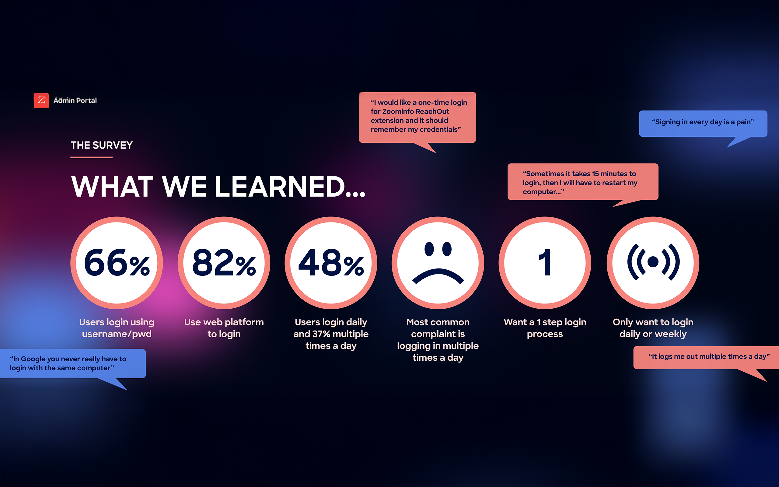
17 unique voices, 5 deep interviews, 6 survey responses.

Research targeted professional women aged 30–55 across three shortlisted audiences: women in corporate roles who want to look polished and credible, women in client-facing roles where appearance impacts perception, and women returning to in-office work after remote periods.

Recruiting ran primarily through LinkedIn DMs (27 outreach contacts), plus OneDay Slack DMs (3), Email (2), Instagram (2), WhatsApp (1), and personal-network referrals (1). Five structured interviews were formally scored: Avelena-Rose Ortega, Melanie Bonner, Julie DaRosa, Renee Muniz, and Keren Wolfovitz.

Pain heat map

Where the pain actually lives — and how often it hits.
Pain pattern Depth Frequency Nature of pain
Chronic physical discomfort (underwear, thigh cutting) 4.5 Daily Unresolved physical pain
Travel + outfit reliability across climates & contexts 4.0 Recurring Systemic planning stress
Fallback to "safe outfits" 4.0 Recurring Reliability / trust failure
Jeans uncomfortable → leggings fallback 3.5 Weekly Chronic friction with workaround
Decision paralysis — can't put outfits together 3.5 Weekly Confidence + decision layer
Repetition fatigue + modesty concerns 3.0 Weekly Psychological fatigue
Laundry / situational pants issue 2.0 Monthly Situational inconvenience

Evidence in the wild

The quotes that changed the direction.
I have a closet full of clothes, but I still feel like I have nothing to wear for work. I just can't put them together. — Keren Wolfovitz · "I relate to that" on the closet-audit slide (+17 best-fit)
It would be nice if I had someone to tell me — or help me figure out — I own these things, get rid of these things maybe. — Renee Muniz · names the decision-paralysis layer
I need someone to hold my hand and hold me accountable. I still have the underwear from 60 pounds ago. — Renee Muniz · body change + accountability driver
I always struggle trying to figure out what to pack for work… I try to have my clothes fit casual, active, and workwear… I pack more because I'm worried it won't work. — Avelena-Rose Ortega · multi-context outfit reliability

Analysis & key learnings

The hypothesis was right on the problem — wrong on the singular solution.

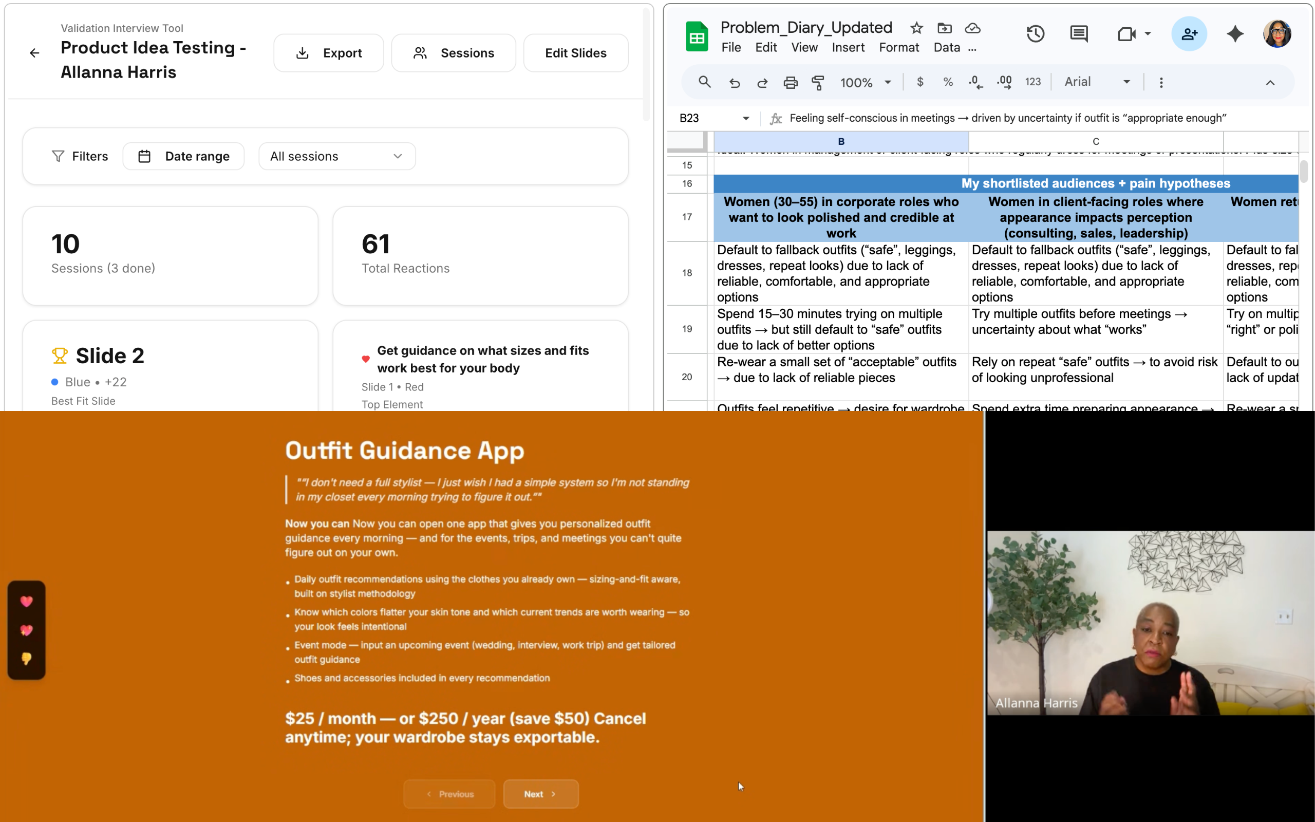
What surprised us — The pain isn't a wardrobe gap. It's decision paralysis. Women have the clothes; they don't trust themselves to use them. Body and life transitions (weight loss, career shift, age) emerged as a strong unspoken driver, voiced most clearly by Renee. Sizing & fit guidance was the highest-scoring single feature (+5) across every interview where it appeared.

What changed — Calendar integration is dead (rejected by 3 of 5 interviewees, −2 score). A flat $50/month subscription is dead (only Keren accepted; Avelena offered $30 max; Julie would spend it elsewhere). The single "Closet Audit" offering needs to flex into three intensities.

What's still unclear — Whether dress-code ambiguity (signaled by Laura Gilbert and Christine Sugimoto) belongs in the core offer or as a feature. Whether higher-touch pricing ($200–$1,500+) holds up outside the interview context. Whether women will renew a seasonal refresh vs. treat it as a one-time engagement.

Decision: Pivot, Iterate, or Persevere

Iterate — same niche, refined angle.

The niche is validated: professional women, 30–55, dressing for work-from-anywhere life. The pain hit hard across 4 of 5 scored interviews and the survey data (4.0+ depth). The closet audit is validated as the core (+17 on the best-fit slide; closet audit +4, sizing & fit +5, 1:1 consultation +3, photo catalog +2, gap analysis +2). What's being refined is the packaging — a single offer becomes three solution intensities to meet women where they are.

Professional women in life or work transitions need a closet-based decision partner that meets them at the intensity they can commit to — from one-time audit to ongoing in-person support. — Refined hypothesis

What's next

Testing pricing intensity across three packages — one-time hybrid service, in-person concierge, and an outfit-guidance app — with the same audience that already engaged with the closet-audit concept. Adjacent niches under watch: women in life transition (strongest emerging persona) and hybrid-work dress-code sufferers.

Honeywell Time & Attendance UX approach — VOC, persona profiles, issue documentation, and on-site visits to plants and call centers
5
Personas built across business units
3
U.S. cities visited on-site
4wk
Research to synthesized findings
15+
Prioritized issues mapped to solutions
Corporate Manufacturing Voice of the Customer Enterprise HR

Voice of the Customer for Honeywell's New Time & Attendance System

Lead UX Researcher · Honeywell · 4 weeks, on-site across 3 U.S. locations

Background

Before a new system, listen to the one people use today.

Honeywell was preparing to roll out a new enterprise time & attendance system. Before defining requirements, leadership wanted a clear view of how employees across all U.S. business units were actually using the current systems — from clocking in on a plant floor, to submitting FMLA paperwork, to running payroll.

I led a four-week Voice of the Customer initiative covering employees, managers, business leaders, payroll, and HR Global Operations. The goal was to surface the real friction in everyday timekeeping so the new system would solve the right problems.

Who I spoke with

U.S. employees across every layer of the business.

Business leaders, employees at all levels, managers, payroll and finance — across Aerospace, Performance Materials, and other strategic business groups. On-site visits in Morristown, NJ; Minneapolis, MN (plant workers, plant supervisors, call center representatives); and Phoenix, AZ (timekeeper administrators).

Approach — Honeywell User Experience (HUE) method

From VOC to a solution map.
Step 1
VOC with business leaders, employees, managers, and payroll across all U.S. SBGs.
Step 2
Understand how each group uses the current time & attendance systems.
Step 3
Build persona profiles reflecting their lived experiences.
Step 4
Document a prioritized list of issues identified by personas.
Step 5
Map every issue to a concrete experience solution.

Personas

Five distinct ways the same system gets used.
Adela
Plant Worker · Minneapolis, MN
Waiting in line to clock in gets tiring. Sometimes the line can get very backed up.
Tools: Honeywell Timelink Clock, paper time-off slips
Top need: Visibility into vacation balance & an easier way to notify supervisors of absence.
Avi
Call Center Representative
The phone and time systems should be synchronized so I only have to log into one system.
Tools: Honeywell eCharge, Avaya, SAP
Top need: Two systems (phone + time) reconciled into a single sign-on flow.
Anna
Timekeeper Admin / HRS Global Operations · Phoenix, AZ
A huge part of my time is spent investigating time and attendance issues.
Tools: HON Time Work Bench (TWB), SAP, KRONOS, Outlook, paper slips
Top need: Self-service for managers; less manual adjustment work.
Tina
Plant Supervisor · Minneapolis, MN
I don't trust the data coming from HON TWB. I frequently go to SAP to check vacation balances. FMLA is a can of worms.
Tools: HON Time Work Bench, SAP, Excel, paper slips
Top need: One trustworthy system of record and clearer FMLA charging.
Frank
Payroll Analyst · Corporate
I track labor and want to know how much to charge the customer. That is my main concern.
Tools: eCharge, SAP, PeopleSoft, KRONOS, Salesforce
Top need: Fewer mid-cycle adjustments; systems that interoperate cleanly.

Synthesized findings

The same six problems, repeated in different uniforms.
Across very different roles — a plant worker, a call center rep, a payroll analyst — the same patterns kept surfacing: too many systems, manual workarounds, no visibility into the data employees needed most.

For employees — lining up to clock in at the "correct" time, no visibility into vacation balance, time and phone systems out of sync, and confusion when shifts change.

For supervisors and managers — checking multiple systems for reliable data, no clean way to charge FMLA, hours spent on manual adjustment, and the question that came up everywhere: why do we approve and submit time?

For admins and HR global operations — adjusting time for hundreds of employees on behalf of others, single-points-of-failure across systems, and constant calls about vacation balances.

Issue → Solution map

Every issue tied to a specific experience solution.
Issue Most affected Direction Solution
Employees stand in line waiting to clock in Factory Review rounding policy; expand clocking to web/mobile devices. New Clock Deployment
Lack of awareness of vacation balance Factory · Admin Show balances during time-off requests on the device employees use. Employee Self-Service View
Supervisors and admins spend hours adjusting time Manager · Admin · Global Ops · Payroll Manager dashboards for exceptions; employee attests; remove paper forms. ESS Request Edit
Must access multiple systems to find reliable data Employees · Managers · Admin Kronos becomes the system of record for all time. Single Simplified System
Difficult to change shift times in the system Across all roles Shift assignments managed in Kronos, override sent to Payroll. Local Shift Control
Lack of knowledge of absence charge codes Manager · Admin · Global Ops Plain-language codes; description-led data selection. Plain Language Charge Codes
Lack of ability to charge for FMLA Manager · Admin Simplify and surface leave processing to employees and managers. End-to-End Leave Processing
Lack of robust reporting metrics Manager · Global Ops · Payroll Single reporting layer in Kronos; no more custom reports per site. Improved Manager Capability
Approving AND submitting time Across all roles Compliance-driven today; reduced to approval only in the new state. Reduced Manager Effort
Adjusting time on behalf of hundreds of employees Manager · Admin · Global Ops Shift the work back to the initiator — employees and managers own their time. Employee Ownership of Time
Lack of system knowledge Global Ops · Payroll Training plan for all T&A resources. T&A Training

Outcomes

From scattered systems to a single, honest source of truth.

The personas and issue-to-solution map became the spine of the new system's requirements. Kronos was chosen as the system of record; employee self-service replaced most paper forms; FMLA was given a visible, end-to-end flow; and the long-running "approve and submit" debate was resolved in favor of a simpler approve-only path.

The research approach — listening on-site, in employees' own environments — became a model I've carried into every research engagement since.

RICHIST case activity notes interface — court hearing note with attachments, correction history, and case-worker tabs
2
Primary personas built (Case Worker, Supervisor)
4wk
Discovery to interactive prototype
9
User scenarios designed & tested
3
Form factors — desktop, tablet, mobile
Government Social Services Field Research Journey Mapping Responsive Prototype

Rhode Island Child Services — Designing a Case Activity Notes System Workers Could Use in the Field

UX Research Lead · Rhode Island Department of Children, Youth & Families (DCYF) · 4-week discovery

Background

A desktop-only legacy system, in a job that happens in the field.

Rhode Island's Department of Children, Youth and Families (DCYF) is the state agency responsible for the well-being of children. Its case workers spend most of their day outside the office — visiting families, observing children in their environments, and appearing in family court.

The legacy case management system (RICHIST) was a desktop application only accessible inside the agency intranet, not well documented, and offline-hostile. Case workers wrote notes by hand in the field, called a dictation service, or waited until they were back at the office to type them up — often hours after the visit. DCYF asked us to capture the requirements for a web-enabled, responsive application that would let workers create and review case activity notes anywhere.

Discovery approach

Four weeks, research to interactive prototype.
Week 1
Project kickoff and whiteboard session with business sponsors — vision, goals, high-level business & technical requirements.
Week 2
3–4 hour sessions with case workers, supervisors, and SMEs to capture user requirements, personas, and scenarios. Technical requirements gathered in parallel.
Week 3
Synthesis: persona profiles, journey map, user-needs matrix, scenarios, and screen flows. Conceptual prototype build begins.
Week 4
High-fidelity interactive prototype + technical roadmap. Stakeholder review and final delivery.

Methods used: contextual inquiry, stakeholder interviews, persona workshops, journey mapping, user-needs matrix, scenario development, screen-flow design, low- and high-fidelity wireframing, and a high-fidelity interactive HTML prototype.

Personas

Two roles. Same system. Very different days.
Terry Smith
Case Worker · 28 · Master's in Social Work
Being able to enter my notes while conducting a site visit would reduce my workload tremendously. Right now I spend a lot of time at the office entering my case notes.
What she does: Manages 16 active cases. Conducts family site visits, participates in family-court hearings, works with parents to close cases. Takes abbreviated handwritten notes in the field and types them up in detail when she's back at the office.

Needs: Enter notes during a visit. Access case-note history while in the field. Attach photos. Send notes electronically to other authorized workers and supervisors. Continue using dictation when she prefers it.
Ally Johnson
Supervisor · 35 · 10 years at DCYF
I spend a lot of time reviewing the completeness of the activity notes entered by team. I wish I had an easier way to track their work and share notes with them.
What she does: Oversees a team of 5 case workers. Approves service plans, reviews notes, and makes sure every case is progressing per plan. Spends a meaningful portion of her week in the field herself.

Needs: A daily digest of her team's field activity. A way for case workers to flag critical notes so she knows where to focus.

Case worker journey

Four stages, one consistent failure mode.

We mapped Terry's day across four stages — Awareness, Investigation & Planning, Visit, and Post-Visit — capturing what she was thinking, doing, and feeling at each step, and the touchpoints she relied on.

The recurring failure: every stage outside the office forced workarounds. She wondered whether a case file already existed (Awareness). She struggled with previous workers' notes when they were rushed or run through dictation (Investigation). She wished she could photograph observations instead of describing them in prose (Visit). And she was often working late, retyping field notes after hours so they'd be in the system as soon as possible (Post-Visit).

That mapping translated directly into a prioritized opportunity list:

Research & Planning — convenient access to all records (past and present), easy editing of past case files, anywhere/anytime access. Onsite Visit — ability to create case notes in a variety of convenient media types (text, photo, audio). Post-Visit — ability to share case files, easily make recommendations, and collaborate with other case workers.

User scenarios

The nine jobs the new system had to do.
# Scenario Who it's for
1Create a new case activity noteCase Worker
2Attach photographs to a case activity noteCase Worker
3Create a draft note to complete laterCase Worker
4Dictate a case activity note (voice-to-text)Case Worker
5View the history of activity notes for a caseCase Worker · Supervisor
6Flag an activity note as criticalCase Worker
7Search note history by participant, category, date rangeCase Worker · Supervisor
8Send a case note to another authorized workerCase Worker · Supervisor
9View an activity feed of recent notes across the teamSupervisor only

The designed system

RICHIST — a responsive case-notes app for the field.

The high-fidelity interactive prototype carried the work from research to something stakeholders could click through. The application opens into three tabs — My Cases, Activity Notes, and Activity Feed — with a notifications bell for notes sent directly to the user.

A case worker can search the full case-note history, open a case file, and create a new activity note with a single button. The note form changes shape based on category (Meeting, Phone, Visit, Report, Task, Interstate Compact), captures participants and face-to-face status, accepts photo attachments, and supports voice-to-text dictation. Notes can be saved as drafts or submitted; once submitted, they can never be overwritten — only appended with a dated correction, preserving an audit trail.

Supervisors get the Activity Feed view — a daily, scrollable digest of every note their team submitted, with critical notes flagged for fast triage. Sending a note to another worker is a single tap. Search filters by participant, category, date range, and "face-to-face only" — exactly the questions Ally said she ran into Excel and email to answer today.

The prototype was designed responsively for the target platform (Windows Surface tablets) and validated across desktop, tablet, and mobile form factors before handoff to development.

Outcomes

Hours of evening retyping → real-time field documentation.

The discovery delivered four artifacts that anchored the build: a set of validated personas, the case-worker journey map, a 9-scenario use case list, and an interactive HTML prototype with the visual design, navigation, and key interactions worked out. The technical roadmap accompanying the prototype identified the technology stack, security plan, hosting options, and the processing/storage implications of adding photo, video, and audio attachments — a question DCYF leadership had specifically flagged in the 10/16 working session.

For Terry's team, the change is simple to describe: she can now document a visit while it's happening, not hours later from her kitchen table. For Ally, she can see what her team is doing across the field in a single feed instead of chasing notes one at a time.

AKRE Tai Chi research — 11 key scenarios mapped across 4 user groups: Patients, Physical Therapists, Tai Chi Instructors, and Physicians
4
Stakeholder groups in the care ecosystem
8
Subject-matter experts & students interviewed
11
User scenarios mapped & prioritized
2
Companion apps designed — clinician + patient
Healthcare Life Sciences Wearables Rehab & Chronic Care Patient Research

AKRE Tai Chi Monitoring App — Designing for Adherence in Mind-Body Rehab

UX Architect · Ayer & Kuris Research Engineering + Spaulding Rehabilitation · 2014–2015

Background

A wearable sensor was solving the measurement problem. The interface was solving everything else.

Ayer & Kuris Research Engineering (AKRE) and Spaulding Rehabilitation were co-investigating a wearable system that could monitor a patient's adherence to — and proficiency in — Tai Chi as a rehabilitation intervention. Tai Chi was already showing promise for older patients with chronic conditions: COPD, heart failure, osteoporosis, stroke recovery, balance disorders, arthritis, traumatic brain and spinal injuries. But the clinical question stayed open: how do you actually prescribe and measure a mind-body exercise?

The sensor hardware could capture motion, orientation, heart rate, and weight shift. What it couldn't do was tell a patient how they were doing, surface progress to a physical therapist, or motivate someone to keep practicing on the days they didn't feel like it. That was the design problem AKRE asked us to solve.

Approach

Four weeks of business-objective alignment, stakeholder interviews, and synthesis into a working prototype.
Week 1
Business-objective workshop with AKRE and Spaulding sponsors — vision, prioritization, and a walkthrough of existing research and sensor specifications.
Week 2
User-research workshops to identify primary / secondary / tertiary user groups, key tasks, and scenarios across the four stakeholder roles.
Week 3
Synthesis: persona profiles, user-needs matrix, scenario-to-persona mapping, and screenflow design for the priority use cases.
Week 4
High-fidelity wireframes for the clinician web application and the patient smartphone app. Final recommendation, deliverables review with AKRE leadership.

Who I spoke with

Three subject-matter experts who would each use the system completely differently — and five Tai Chi students who'd already lived the practice.
Peter Wayne, PhD
Assistant Professor of Medicine, Harvard Medical School · Director of Research, Osher Center for Integrative Medicine · Brigham & Women's
It would be great if the application could be your "partner" — react and respond to your movements. Something that softens the edge of the technology.
Brought to the table: what the practice is, how teachers judge proficiency (gross choreography, alignment & posture, integration, yin/yang), and the visual-design vocabulary the app should inherit — plum blossoms, water, flow.
Gloria Yeh, MD
Physician-researcher, Harvard Medical School · COPD and cardiac-rehab trials
It is difficult to quantify dosage. What are the participants getting and how do we prescribe? Having something that can monitor is helpful due to the inability to quantify.
Brought to the table: the clinical-trial perspective — how cardiac and pulmonary rehab patients behave during a 12-week program, what happens to adherence after they go home, and the specific question that anchored the work: how do we keep them moving?
Paolo Bonato, PhD
Director, Motion Analysis Laboratory · Program Director, Spaulding–Harvard SCI Model System
The therapist would be the primary user — examining reports, adjusting intervention and dosage. The physician looks at it sporadically. The patient needs a gross assessment, with the option to dig into it.
Brought to the table: the sensor science, the realistic threshold of "how much will a patient wear," and the visual-inspection scoring model already used for stroke and Parkinson's evaluations.
5 Tai Chi students
Norman, Nancy, Laurie, Howard, Betsy · Mix of male/female, 1–3 classes/week, varied conditions
Feedback is very important. Make it friendly — no steep learning curves. I'm not technically savvy, I have a flip phone.
— Nancy

I ask for feedback sometimes. The form is complicated. I wish there were less focus on precision and more on the general idea.
— Howard
Brought to the table: the lived experience — why they practice (arthritis, balance, fibromyalgia, meditative reasons), how they self-coach with DVDs and homemade videos, and what they'd actually wear (a watch-style accessory, yes; multiple leads, no).

The four personas in the care ecosystem

One platform. Four very different jobs.
Francine Wilson, 67
Patient — COPD, diabetes, severe arthritis
I am going to try to take at least one Tai Chi class a week in hopes that it will help with my health issues.
Top needs: Breathing & relaxation assistance · Help with simple routine movements at home · A guided program with correction · Alternative movements for the days arthritis flares.
Mark Stafford, PT, DPT, NCS, 39
Physical Therapist — neurologic rehab (Parkinson's, stroke, balance, spinal)
It's difficult for me to motivate my patients outside of the PT Center.
Top needs: View patient progress remotely · Adjust dosage based on performance · Quantify "how much is enough?" · Send practice reminders · Confirm patients are adhering to the correct exercises.
John Jackson, 35
Tai Chi Instructor — Tai Chi Healing Center, 12 classes a week
I find that my students want more one-on-one assistance to know if they are performing Tai Chi correctly.
Top needs: See how students perform specific movements outside class · Monitor breathing and mindfulness · Communicate with patient and PT inside the app rather than across email and phone.
Dr. Frank Wilford, 62
Orthopedic Surgeon — Mayo Clinic
I am very interested in understanding if Tai Chi is a tool that can help improve my patients' quality of life. How can I measure that? Can something like that even be measured?
Top needs: Lightweight, periodic check-ins on patient practice frequency and performance · High-level analytics — vitals, dosage trends, compliance — without having to chase notes from PT or instructor.

11 scenarios, 4 user groups

Mapping every job the app had to do — and which persona owned it.
Scenario Patient Physical Therapist Tai Chi Instructor Physician
1 · Monitor patient vital signs
2 · Monitor patient Tai Chi movements
3 · Provide movement correction & assistance
4 · Provide patient motivation
5 · Provide breathing assistance / meditation
6 · Communicate with application stakeholders
7 · View vitals, performance, progress, dosage
8 · Send / view practice reminder
9 · Select patient health issue
10 · View patient health issue
11 · Help with applying the sensors

Findings that reshaped the design

The interface had to answer questions the sensor couldn't.

Dosage is the unsolved problem. Treadmills measure miles. Tai Chi has no obvious unit. Gloria Yeh framed it most clearly — the meditative quality is exactly what helps the patients who can't or won't engage with traditional cardiac rehab, and it's also what's hardest to quantify. The app would have to fashion a score around quality of practice, not just minutes logged.

The adherence cliff is real. Rehab programs end after 12 weeks. Patients regress. "Tai Chi to keep them moving" was the explicit motivation behind the trial. Practice reminders, partner-feel feedback, and mood-and-pain check-ins before and after each session were designed specifically to fight that cliff.

Patients want feedback, not precision. Howard, Laurie, and Betsy all said the same thing in different words — they don't want to be told they're 30% off on the angle of their stance. They want a general sense of how they're doing, delivered subtly (color or light, not a tone), and reminders for what direction they should be facing or how far apart their feet should be.

Wearable tolerance is narrow. The patient population skews 50–80 years old. They'd wear a Fitbit-style accessory. They will not wear "anything with too many leads." That single constraint shaped every screen on the patient app — the sensor instructions take two screens, not twenty, and the sensor lives on the wrist and ankle, not strapped across the torso.

The app should feel like a partner, not an instrument. Peter Wayne pushed hardest on this — make the visual language soft and human. Plum blossoms, water, flow. Use compassion and kindness as adjectives for the UI, not "compliance." The app shouldn't teach Tai Chi; the therapist and the instructor do that. The app should witness, encourage, and report back.

The designed system

Two companion applications, one shared care record.

The system was designed as two surfaces — a clinician web application for therapists, instructors, and physicians, and a smartphone app for the patient.

Clinician dashboard. A care provider logs in to a patient timeline that anchors every event to a date: practice start, dosage adjustments, alerts (e.g. blood pressure abnormally high), and clinical appointments. Three tabs sit alongside it. Patient Vitals charts heart rate, breathing rate, lung function, and blood pressure with timeline graphs and a body diagram. Self Reporting shows mood (happy / sad / tired / in pain / OK), pre- and post-practice symptom reports, practice frequency, and the patient's own free-text notes — plus an overall Score badge so a clinician can triage at a glance. Notes is the shared record for the PT and the instructor, with the current Tai Chi prescription pinned to the side. Setup includes assigning the patient a condition (e.g. COPD) and choosing which vitals to monitor.

Patient smartphone app. The patient flow is deliberately spare — 10 screens covering everything a 67-year-old practicing at home needs to do. The day starts with a practice reminder. A two-minute breathing exercise warms them up. The Tai Chi practice dashboard shows a body figure with the current position and three live readings — blood pressure, heart rate, breathing — sized for older eyes. If a movement drifts, a soft Movement Correction Alert appears with the option to ignore or watch a short video of the correct position. Menu, Settings, sensor-application instructions, and direct contact info for the Tai Chi instructor, PT, and physician are reachable from anywhere. Motivation, alerts, and music are toggles, not defaults — because Howard and Betsy specifically asked for subtlety.

Outcomes

From a sensor with no story to a system clinicians and patients could see themselves inside.

The engagement delivered the four artifacts the AKRE / Spaulding team needed to move from research hardware to a partially-functional prototype: validated personas across all four stakeholder groups, the user-needs matrix that mapped 11 scenarios to who actually performs them, a recommended screenflow connecting clinician setup to patient practice, and high-fidelity wireframes for both the clinician dashboard and the patient smartphone app.

More importantly, the research reframed the problem. The trial team had approached this as a measurement project — get the sensor data out, hand it to a clinician. The work made the case for a different bet: the experience layer is the intervention. Without an app that could reach Francine on the days she didn't feel like practicing, and without a dashboard that gave Mark and Dr. Wilford a reason to look between visits, the sensor data would never make it into a clinically meaningful loop.

T-CREW team-member dashboard sketch — migrations, defects, workload, and challenges visualized across DevInt / ST1 / ST2 environments
2
Distinct teams researched (CMTS + QA)
4wk
Discovery to future-state recommendation
4
Strategic themes prioritized
12mo
Phased implementation roadmap
Financial Services Workforce Engagement Gamification Internal Platforms Stakeholder Research

TIAA-CREF nVision — A Social & Gamification Strategy for Engineering Teams

UX Research Lead · TIAA-CREF CMTS & QA Teams · 4-week engagement, March–April 2015

Background

Two distributed engineering teams running on cranked-out execution and burnout.

TIAA-CREF asked us to help two of its internal engineering organizations — CMTS and Quality Assurance — design a path toward a more engaged, collaborative, and innovative workforce. Both teams were distributed across geographies, mixed full-time staff with contractors, and rotated shifts. Both were under aggressive timelines, with continuous scope change, and very little visibility into who was working on what.

The brief was unusual for an internal-platform engagement: rather than replatform a single tool, the work would produce a strategic roadmap for an immersive, social, and gamified platform — plus a clickable prototype of the most important use case to anchor the recommendation.

Who I spoke with

Both teams. Every layer.

Across the assess-and-identify phase I worked with both organizations in stakeholder workshops, individual interviews, and surveys, covering:

CMTS roles: Shift Lead, Program Manager, Support Engineer.
QA roles: Project Lead, Vendor Lead, Program Manager, Test Engineer.

Stakeholder interviews started with Byron Griffin and Shifad Wahid, and expanded outward via a half-day orientation workshop and a structured design challenge with members of both teams. Individual interviews and surveys ran across the second week, anchored to a 22-question pre-assessment questionnaire I authored to capture daily activities, tasks, devices, blockers, collaboration patterns, and feedback loops.

Discovery approach

Four weeks. Assess, define, prototype, recommend.
Week 1
Project kickoff, stakeholder interviews, orientation workshop, and a design challenge with mixed CMTS/QA participants.
Week 2
Journey mapping for QA and CMTS, individual interviews, and surveys. Project objective & KPI definition workshop.
Week 3
Use-case inventory and prioritization. Stakeholder objectives & system goals matrix. Wireframes for the priority use case.
Week 4
Visual design comps, clickable prototype build, social & gamification strategy, and the future-state recommendation report.

Persona challenges — the patterns that repeated

Same root problems, different teams.

CMTS — Support Engineers, Shift Leads, Program Managers

No collaborative physical space. Work arriving through multiple systems and instant messengers with no way to track or formally assign it. Lack of onboarding, knowledge transfer, or mentoring. No formal way to recognize or reward performance. People cranking out tickets and burning out. Vendor team members in particular had no formal feedback loop with management.

QA — Test Engineers, Project Leads, Vendor Leads

Mixed full-time-plus-contractor staffing on rotating shifts. Individual performance only communicated verbally. Recognition tied to project completion, not to individual contribution. No place to share ideas. No clear process for getting work done. No accountability — people weren't required to take ownership and wouldn't volunteer to unless they'd already succeeded at something. Automation was named as the single biggest unmet goal.

From themes to a roadmap

Four themes, prioritized with stakeholders.
Theme What it solves Sample initiatives
01 · Innovation "Cranking out work" with no time or vehicle for fresh thinking Innovation workshop · Innovation KPIs · Crowdsourced idea management tool · Idea-implementation budget
02 · Quality Inconsistent test coverage, under-automated regression, weak status reporting Test-coverage & automation KPIs · Test-case optimization · Digital strategy plan · Standardized status reporting
03 · Productivity Distributed teams, unclear goals, no recognition path, weak training Productivity KPIs · Performance tracking tool · Training management · Crowdsourced training · Collaboration platform · Employee engagement platform
04 · Accountability No shared definition of "delivered well," no audit trail Platform Delivery Quality (DQ) KPIs · ALM usage optimization · Shift-Left training and delivery plan · Partner-team relationship building

The four themes were sequenced into a 12-month, three-phase roadmap: Standardize (establish KPIs and foundational steps), Analyze (measure and report against them), and Improvise (act on what the measurement reveals). Foundational steps in each theme were called out separately so leadership could green-light the dependencies before the big initiatives moved.

The signature initiative — T-CREW

TIAA-CREF's Route to Engaged Workforce.

Sitting at the intersection of all four themes was the platform recommendation we called T-CREW: an immersive workforce-engagement application that would let team members, leads, and managers run the day-to-day job — tickets, environments, SLAs, workload — through a layer of social, gamified mechanics built around recognition and learning.

The clickable prototype anchored the recommendation. The Overview dashboard surfaced what mattered to a Support Engineer or Test Engineer in a single glance: environments (Open / WIP / Closed), SLAs (Red / Yellow / Green), and personal vs. team workload. Around it sat the engagement scaffold — earning points for completing help tickets, team-wide challenges (e.g. "60 Ticket Dash"), a live activity feed of peers' achievements, and a Buddy pairing system to fight the isolation the distributed-shift model created.

The visual language deliberately leaned playful — a beach / lifeguard theme as one of several swappable visual themes — to push back on the "execution-only" culture both teams described. Themes like Sports Teams and Rock Bands were considered as alternatives so different sub-cultures inside CMTS and QA could opt into a feel that suited them.

T-CREW was scoped at 12 person-months, medium complexity, on an open-source J2EE stack with modern SOAP/REST/OData/JDBC interfaces — so it could integrate with the existing tools both teams already lived in (ALM, ticketing, Communicator/IM) rather than replacing them.

Outcomes

A strategy leadership could sign off on — and a prototype the team could feel.

The engagement delivered four artifacts: a current-state assessment report grounded in the workshops and individual interviews, a prioritized future-state vision across People / Processes / Systems, the four-theme 12-month roadmap with project-level effort estimates and dependencies, and the T-CREW clickable prototype with proposed team structure, roles, and a 12-week build plan.

Beyond the artifacts, the engagement reframed how leadership talked about the problem. The CMTS and QA teams' issues had been read as a morale problem; the research showed they were a system problem — no shared definition of done, no recognition tied to individual contribution, no place to share ideas, no time to innovate. T-CREW wasn't proposed as a fix for any of those individually. It was proposed as the platform on which fixing all four could finally be measured.

ZoomInfo login survey results — 66% username/pwd, 82% web platform, 48% daily logins, sad face, 1-step login wanted, daily-or-weekly cadence
26
Survey responses from ZoomInfo Champions
6
Customer interviews across roles and industries
9
Design opportunities synthesized
380k+
Weekly logged-in users in the dashboard analysis
SaaS Authentication & Identity Mixed-Methods Research Quantitative + Qualitative

ZoomInfo Login Redesign — Fixing the First Five Seconds of the Product

UX Research Lead · ZoomInfo Admin Portal · Customer Champions program

The problem

A pattern of complaints about a moment that should be invisible.
How do we provide a seamless, easy-to-use login experience for our customers? — The opening question of the engagement

Login isn't supposed to be a feature. But a steady drumbeat of customer complaints — from CSMs, from support tickets, from word-of-mouth — said the first five seconds of ZoomInfo were costing us trust. People were logging in multiple times a day, getting kicked out across tabs, landing on screens they didn't ask for, and not knowing how to get help when they were locked out. The question was no longer "should we look at this" — it was "how big is it and what do we actually fix first?"

Focus areas

Where we agreed to look first.

Three areas anchored the research before we talked to anyone:

The login page landing experience — should be clean and polished, simplicity over volume. Do we still need the ads and marketing on this screen? Chat — interviews had already suggested chat was useful here, so where should it actually sit and what flows should it support? What else — what other flows beyond the current set might belong inside a chat layer if we treated this as more than a static screen?

Approach

Mixed-methods. Quantitative width, qualitative depth, behavioral truth.
1 · Survey
26 responses from ZoomInfo Champions across industries and company sizes — login methods, frequency, device, friction points, and willingness to be re-contacted.
2 · Interviews
6 deep customer interviews with respondents who opted in — Business Development through C-suite.
3 · Analytics
Tableau "Login Experience Dashboard" analysis — 380k+ weekly logged-in users, average logins per user per active day, login-type mix (Credentials / GoogleSuite / Office365 / SSO), and weekly login support cases over the prior quarter.
4 · Synthesis
Cross-walked complaints from interviews against the support-case volume and login frequency by segment to prioritize what to fix first.
5 · Design
Mapped the ideal user flow — first attempt through session timeout, abuse detection, forced logout, and remember-me — to anchor design and engineering scope.

What the survey said

The behaviors were less surprising than the expectations.
66%
Log in with username + password
82%
Use the web platform to log in
48%
Log in daily
37%
Log in multiple times a day

The complaint that came up first, last, and most: having to log in multiple times a day. People wanted to stay logged in longer. They wanted a one-step process that recognized them. They didn't want unreasonable things — most expected to log in daily or weekly, and were fine with that. They just wanted the system to honor the expectation.

Customer voices

Five people. Five very different jobs. Same login experience.
Annika
Business Development Rep · Level Data · Kalamazoo, MI
Sometimes even after logging in I'll have to refresh the page again to get it to load, because I live and die off the extension literally.
What she surfaced: ReachOut extension and the web app feel like two unsynced products; help is a maze ("ask someone to ask someone to submit a ticket"); 2FA on a non-bank product feels like overkill.
Michelle
Marketing Communications Manager · COINS · Latham, NY
When I open another tab, it doesn't mean I'm logged in. I have to re-log in. That's always been my experience.

I don't even look at the login page — most of it isn't relevant to me and it doesn't matter.
What she surfaced: The multi-tab session model doesn't match user mental models; the marketing on the login page is invisible to existing customers.
Anthony
COO · Loop1 (acquired Xlate Group) · Texas
For me the amount of time I spend logging in compared to the amount of time I actually spent working is quite high.

I'd love to get rid of that middle screen. I'd love to say by default, here's where I'd like to go.
What he surfaced: Short-session "dip in / dip out" usage is the dominant pattern for executives. The app launcher / middle screen is friction, not value. Even SSO was rejected because "it was slower."
Daniel
President & Founder · Adatasol · Ohio
I need to be able to hold my login and I need ZoomInfo to take me back to where I was before getting interrupted.

If I were logged in for more than 2 hours and stepped away, I'd have to re-login.
What he surfaced: The "take me back to where I was" job-to-be-done. The benchmark people compare ZoomInfo to is HubSpot — which has gotten dramatically better and "stays logged in forever."
Peter
Director of Enterprise Transformation · Pragmatic Institute · Texas
Login is a necessary evil.

If you pop me back into what I was doing before, if that was the default, that would be kind of cool.
What he surfaced: Browser-native solutions (fingerprint readers, Safari/Chrome password managers, OS-level autofill) are what users actually rely on. The product's job is to not break those flows. Cross-browser parity matters — Safari users feel like second-class citizens.

What we learned

The login problem was actually a session problem.

Cross-walking the survey, the interviews, and the dashboard data, the same 10 themes kept resurfacing. Frequency of forced login is the single biggest complaint. Most users save credentials in their browser — the app is competing with autofill, not the password field. Confusion over how to get help cropped up in every interview. ReachOut and the Zoom App require independent logins and shouldn't. After logout users struggle to find where they last were. Performance is intertwined with login pain — sluggish loads are read as failed logins. The App Launcher page provides little value and is the first thing executives ask to remove. Password reset takes too long; the gap between the request and the email arriving feels endless. The ad on the login screen has no audience — it's served to customers who already pay. Opening multiple tabs sometimes requires re-logging in, which directly contradicts the mental model users carry over from every other modern SaaS app.

The opportunity — what we recommended

Nine concrete moves, prioritized for engineering.
Move What it does for the user
Improve performance overallRemoves the "did login fail or is the page just slow?" ambiguity.
Extend login session timeHonors the daily/weekly cadence users actually expect.
Recognize previous logins & saveStops asking known customers to prove they're customers.
Improve help experiencesSurface the user's CSM/AE name and contact; promote chat to a first-class placement.
Sync ReachOut & Zoom App loginOne identity across the extension and the web app — the "Apple Watch + iPhone" expectation.
Return users to their last locationThe single most-requested behavior across interviews — at both the app and page level.
Simplify password resetShrink the wait between request and email; remove ambiguity in the flow.
Remove ads on loginExisting customers don't need to be sold to. Reclaim the real estate for clarity.
Share session across tabsMatch every other SaaS app on the planet. Stop forcing re-login on tab open.

The designed flow

From first attempt to forced logout — one diagram, every branch.

The recommendations landed in an Ideal User Flow that gave engineering a single map to scope against. It covers the first-time login (username/password, social logins, or SSO with "pick one method"), the Remember-Me path with multiple-account memory, 2FA when SSO is off, the access-token / refresh-token lifecycle with maintained session history, multi-tab auto-login, and the full session-end taxonomy: session timer expired, inactivity timer expired, invalid token, abuse detected, and forced logout. Each end-state has its own pop-up message, re-authentication decision, and auto-login return. The "user clicks Sign Out" branch deliberately keeps the user's identity recognized so that next time it's a one-tap return.

The flow doubled as the rubric for prioritization. Anything that couldn't be traced to a node in the diagram didn't make the cut.

Outcomes

From "users are complaining" to a prioritized, evidence-backed engineering plan.

The research turned an unbounded complaint stream into a ranked, evidence-backed list of moves with the user voices behind each one. It gave the team license to do the unglamorous fixes — session length, tab-sharing, the App Launcher, ad removal — that the data said mattered most, instead of going first to the visible-but-minor cosmetic redesign. And the customer-voice slides became organizational shorthand for the work: Anthony's "I'd love to get rid of that middle screen" and Peter's "login is a necessary evil" showed up in roadmap reviews for months.